Table of Contents
Summary
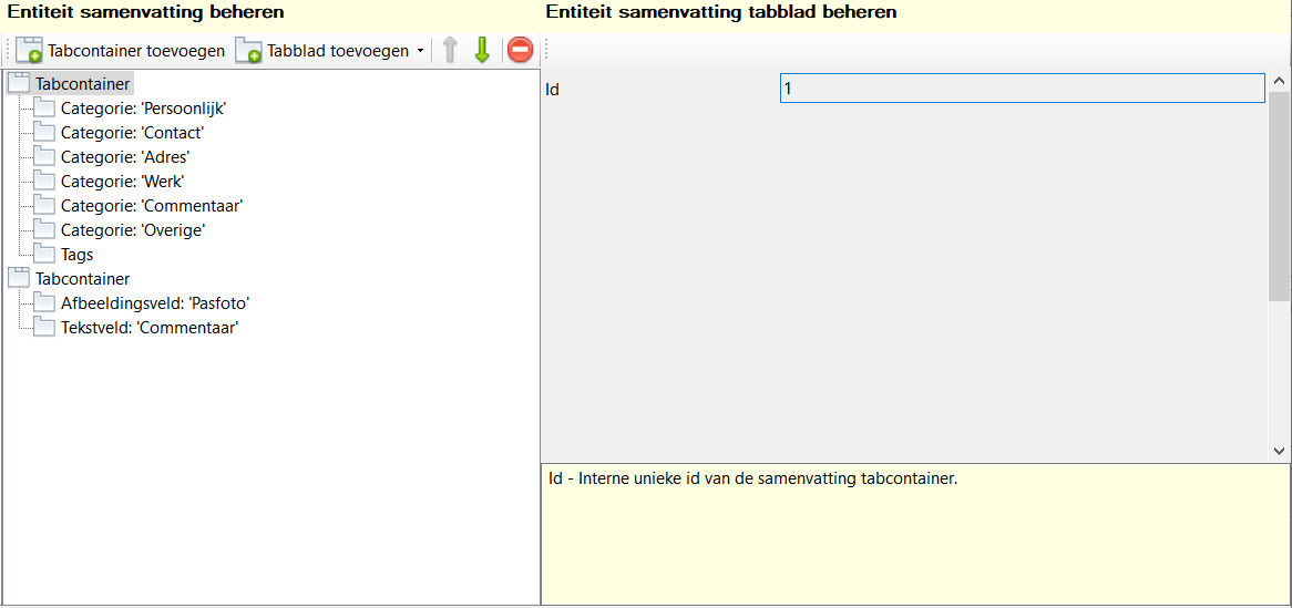
Toolbar
All the buttons from the toolbar are explained below.
| Command | Description | |
|---|---|---|
| image | Add tab container | Add new summary tab container |
| image | Add tab page | Add new summary tab page |
| image | Move up | Move the selected tab container or tab up one line |
| image | Move down | Move the selected tab container or tab down one line |
| image | Delete | Delete selected tab container or tab |
General
Via the summary you can view your entity at a glance in the main window. The form of the summary is entirely customisable.
Order
The order of the tabs in the designer is from top to bottom, and that is displayed in the view application from left to right.

Managing tab containers
Add a tab container
Via the Add tab container add a new tab container to your summary list, the tab container is added at the bottom, and initially contains no tabs.

Add tab
Via the Add tab you add a new tab of your chosen type to the currently selected tab container, a tab is always part of a tab container. The tab is added at the bottom of the tab container.

Move tab container up/down
By selecting a tab container, you can use the up/down buttons to move the tab container down or up one position at a time.
Move tab up/down
By selecting a tab, you can use the up/down buttons to move the tab one position down or up. If you move the tab within a tab container, it is simply moved one position down or up.
If a tab is already at the bottom or top position of a tab container, it is moved to the next or previous tab container, this allows you to move the tab between different tab containers.

Delete
Via the Delete you delete the selected tab container or tab. This action is irreversible, but only becomes final when you save your database.
When a tab container is deleted, all tabs within that tab container are also deleted.
When a tab is deleted, only that tab is deleted.
Managing tabs
Settings
Id
This field displays the internal id of the tab. This field is read-only, the id is determined at the time the tab is added and cannot be changed. This id does not appear anywhere else in the view application.
Type
This field displays the type of tab, you choose the type when adding a new tab. The type cannot be changed after adding the tab. Based on the type, different properties are available.
Category / Text field / Image field
Here you select the source of the information the tab should display. An item must always be selected.
Shortcuts
Window wide
See main window.
Component specific
None.


